Course Overview - UAL Print Media & Journalism Level 3 Extended Diploma

A little about myself:

My name is Alfie Mills and I am studying Print Based Media and Journalism as a Level 3 Extended Diploma. I study this course at SouthEssex College on a 3 day per week basis ranging from Tuesdays to Thursdays. In this course I hope to develop and learn new skills in order to create and publish things such as books, magazines, and articles. I also wish to learn different techniques in which i can interview someone, take notes about what people say and learn the correct usage for a dictaphone and other equipment used in todays modern media.


What the course is and contains:

Print Based Media and Journalism is designed to take you into the hands of what a real professional publisher and reporter/article writer has to deal with in their day to day life. This includes learning software which is used on computers (Adobe software mostly) and also writing techniques to create our own articles and news paper stories like we would in the real world. 

This is not the only thing the course covers in 2 years though, here is a list of everything taught and produced in the course itself:
  • newspaper and magazine production
  • article writing
  • interview and presentation techniques
  • website design
  • photography
  • digital image manipulation
  • traditional print methods
  • visual analysis


Why I chose this course:

My initial choice for this course was because of the idea of being able to get creative with the idea of making my own products which could be published. I enjoy using my computer and programs such as Photoshop and Illustrator on a daily basis and also would like to potential work as someone who creates and publishes their own magazines or works in a company producing work to be published and seen by hundreds. This idea excites me and as a writer, artist and in general, creative person, this course ticked all the boxes for me.

Unit 54 - Digital Graphics For Print

Unit Aim:

The aim of this unit is to give learners the knowledge and skills needed to produce, process, control and manipulate digital graphics used for a range of print, interactive and moving media.

 Purpose:

As the first step on your journey to becoming an expert in your field of the media industry you must acquire, develop and test the new skills that will allow you to create outstanding media products. This is also an opportunity to learn new skills and enhance existing skills in a portfolio of disverse work which demonstrates your ability to grasp new concepts and apply them.

Scenario:

Unit 54 develops leaner appreciation of the techniques employed by other practitioners in the field before moving on to give them first-hand experience of preparing for and conducting design work for media products.
Your client requires you to research, develop and produce an 12 page A5 Booklet about a subject you are passionate about. The subject of your book can be about anything that you choose, but must be engaging and informative. You are tasked with making your subject appeal to its readers.

What to consider:

  • Your audience know nothing about your chosen subject
  • Your booklet must be factual and well researched
  • You must make your information interesting and aesthetically pleasing
  • You must stick to the size and page numbers required in brief

 Citing - Skills Development Portfolio and Unit 54 explanation hand out

Brainstorming Idea's for A5 Booklet

Initial idea's:

My first initial idea is to base my booklet around gaming. I'm a big gamer having played games and being consumed by the technological world ever since i was four with a GameBoy Color, eventually moving onto things such as the Playstation, a Playstation 2 and eventually PC Gaming. From here i had a few options.


 My first option was to pay homage to my most beloved and favourite game franchise; Spyro The Dragon. I had plans of going through the era's of the game and having an in depth analysis of different bosses and enemies you encounter along the way. Another thing i wanted to touch upon was the collection system whether it be eggs like in Spyro 3, rescuing the dragons from the first game or orbs from the second.


 My second option is to base it around another game franchise of mine which i hole close to my heart; Animal Crossing. This game is one of my favourites because of its replay-ability and different stuff you can encounter. For the booklet i would use two pages each on the different types of bugs, fish and fossils you can find. I'd also commit a page to the villagers, the are npcs which make the game up, going over the more important ones to the just general folk which make up your town.


This brings to my third and final option i had, base my booklet around my most played game for the past 4 years, TeamFortress 2. I chose this idea because it's the game I have played the most of recent and i've spent a long time playing it. I am familiar with everything about it and its something I love. In my booklet, i will write about everything new and upcoming within the realm of TF2, this includes updates and different cosmetics in the game you wear as well as new maps and game modes.


Brainstorming idea's - Final Design

Here I have compiled my 3 idea's into a brainstorm which shows off my thought process and idea's I had along the way.


Full link to the image is found here - http://goo.gl/2kxXBc

Typography - Kerning - Serif and Sans-Serif

Definition of Typography:

Typography;
noun
The style and appearance of printed matter.
The art or procedure of arranging type or processing data and printing from it

Short History on Typography:
Typography first started as cave paintings and drawings on the walls of caves and other surfaces such as bark. These were called pictograms and told a story as you looked along them. From pictograms came Ideographs which substituted common symbols and abstractions for pictures of events. For example, a star in an ideograph resembled the heavens or a peace pipe which resembles peace. From here on a system developed from the egyptians, this was called Hieroglyphics, these were the first drawings used to represent not just objects or idea's but also sounds too.
Since then we have come a long way with how we communicate and our ways of doing so, since 1200 BC we have used an Alphabet first developed by the Phoenicians which was completely composed of letters instead of the less independant and simple hieroglyphics. The greeks then adopted the language created by Phoenicians adding the first 5 vowels which is also the beginning of the modern alphabet we use today. To keep the rest short, the Romans developed the alphabet further by using 23 letters and introducing serifs which are the small flourishes/finishing strokes at the end of letters. We get our mass printed and published materials from the 1400's where Guttenberg invented a system of movable type that revolutionized and changed the world forever, allowing this mass printing of materials.

Kerning -

Kerning is the space between two characters in a word or sentence. Whilst kerning generally implies a reduction of space between both the letters, it can also mean the addition of space between lettering too, and well-kerned fonts and lettering have a visually similar area of two-dimensional blank spaces between each pair of characters as well.

Good Kerning and Bad Kerning:


Why the kerning on the left is better than the right?

Using what we said above, the kerning featured on the left is better than the kerning on the right because of the spacing. You can see the difference visually and how more visually pleasing and correct it looks, there is not too much space between both letters which shows they both belong to each other but also, the spacing on the right looks a bit excessive and unneeded when you could just tie the lettering closer together and make your font look neater and tidier as a whole.


Serif and Sans-Serif

A Serif and Sans-serif is a different kind of typeface in typography, both are different because of the qualities they possess, for instance, a serif has small flourish on the end of its characters and was first invented by the Romans. A Sans-serif on the other hand doesn't have small flourishes or small strokes at the end of its characters and is used more informally when typing whereas fonts such as Time New Roman are used to formally type up letters and emails to people.

Serif and Sans-Serif fonts:


All these different fonts are Serif fonts and as you can see, they notably have flourishes at the end of each character. Below is an example of the different Sans-Serif fonts available.


Parts of a letter:


Type Anatomy - 

Characters - A symbol which represents a number or letter
Characters are what make up the the letters of our alphabet and the numbers we use in mathematics and create words in our language.

Special Characters - These are characters such as %, $ and &. Note, they are non-alphabetic nor are they non-numeric.

Ligatures - Ligatures are where two or more letters are joined together as one glyph, this means that they replace characters which share common components and are part of a general class of glyphs called "Contextual forms".

Character Components - 

Ascender - A part of a letter which extends above the level of the top of an 'x', letters like this include the letters such as a 'b' or an 'f'.


Bar - A horizontal stroke in characters, letters such as A, e and R have a bar.


Baseline - Non-existant straight line across the feet of most letters in a line of type


Bowl - The curved stroke that creates an enclosed space within a character, an example would be at the letter B


Bracket - A curved connection between the stem and serif on some fonts, this can be seen on letters like 'u' but is dependent on the font used.


Contrast - Contrast is the difference between a number of things, including scale, weight, classification, case and colour.


Counter - The partially or fully enclosed space within a character.


Descender - The part of a character such as g or j which descends below the baseline.


Loop - The lower end of a lowercase g.


Sans Serif -  A style of type which doesn't contain flourishes at the end of its lettering.


Shoulder -  A curved stroke in the letters h, m and n.


Stem -  Straight vertical stroke, or the main straight diagonal stroke in a letter which has no verticals at all.


Stress - The direction of thickening in a curved stroke.


Terminal - The end of a stroke not terminated with a serif.


X-height -  The height of lowercase letters, specifically the lowercase x, not including ascenders and descenders.

File Formats Research Part 1

Overview:

As a publisher or publishing company, people must deal with a range of different file formats and learn what is preferred to be used for different things such as graphics creation, final design exporting, photograph editing and also moving image file types. It is also important to learn different file types and what to use for publishing on the web and the size, colour as well as difference between pixel and vector images.

. PNG - PNG stands for Portable Network Graphics and is a raster graphics file format which supports the ability of lossless data compression. The .PNG file was created to be an improved replacement for the .GIF file format but non-patented. Since then, a .PNG has become the most used lossless image compression format to be used on the internet.

What uses does a .PNG have and why use a .PNG?

A .PNG is most commonly used on the web because of its lossless data compression, images are more clearer and have more colours than a .GIF file can hold which means you see more of what the image is actually like. One downside to a .PNG is that the file size can vary greatly depending on a number of different factors, these are those factors:

  • Colour Depth - This can range from 1-60 bits per single pixel
  • Ancillary Chunks - A PNG supports metadata which is useful for editing but not needed for viewing on websites.
  • Interlacing - When each pass of the Adam7 algorithm is separately filters, the file size can increase considerably
  • Filter - Filter is a pre-compression stage in creating and saving a .PNG, each line is filtered by a predictive filter which is different from line to line. You are unable to optimise this row by row however though, therefore the choice of filter for each row is then potentially very variable.
. TIFF - A .TIFF file stands for a Tag Image File Format and is similar to a .PNG in the sense that it is a raster graphics file format and is commonly used for exchanging these images between application programs such as Adobe Photoshop. .TIFF files are also used for when you scan an image into your computer which can also be later worked on in image editing or publication programs.

What uses does a .TIFF have and why use a .TIFF?

.TIFF files are used and can be used in several different publishing techniques, these include desktop publishing, faxing, 3D applications and also medical imaging applications. A .TIFF is used when all detail of the image must be preserved and the file size doesn't matter or isn't taken into consideration which is why most professional and commercial printing needs are done with this file format. They also support a number of different classes too, which includes the following:

  • Grayscale - Greyscale is the range of different shades, from white to black which are used in a monochrome display or printout.
  • Colour Palette - Logical colour numbers are stored into each pixel, normally represented as RGB ( Red, Blue and Green)
. JPG - Joint Photographic Experts Group
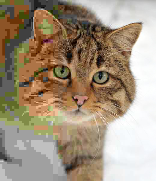
A .JPG is a file extension commonly used for lossy compression and is used mainly for digital photography. The file format allows you to change quality via the compression rate, decreasing or increasing it dependant on its resolution. To further explain what i mean by this, here is a photograph of a cat and as the compression rate increases and decreases.

As you can clearly see, the quality over the whole image improves a lot the less you compress and more you leave its quality high. This does come with a problem though, the higher quality your .JPG looks, the bigger the file size will be compared to whether you compress it down. Though you can compress the file as low as shown on the left of the image, this is rarely done because of its pixelation and how bad the quality becomes.

What uses does a .JPG have and why use a .JPG?

The .JPG is the most common file format for storing and transmitting photographs across the World Wide Web. Because of this, these images are used in websites to display and provoke more thought to a piece of text. A .JPG is used because of its lossy compression, meaning its compression and quality can utterly depend on your preference and can also maintain a small file size if needed.

. TGA - A TGA (TARGA) file stands for Truevision Advanced Raster Graphics Adapter. Like the previously mentioned .PNG and .TIFF, it is also a raster graphics file format. Resolutions of .TARGA image files usually match those of NTSC and PAL video formats and was created for video editing with PCs by Truevision Inc. 

What uses does a .TARGA have and why use a .TARGA?

A .TGA is most commonly used for video tape and video publication, specifically they are used in the rendering of still images and to render sequences of still image to video tape. You should use a targa file if you're creating anything to be used and added into video such as image stills and multiple images to create a sequence of moving image. Another reason they're used is because the format can store image data with different bits of precision per pixel. These are the following bits a TGA allows:

  • 8 bits
  • 15 bits
  • 16 bits
  • 24 bits
  • 32 bits


File Formats Research Part 2


.AI - Adobe Illustrator Artwork
An .AI image is a vector image file format created in 1987 by Adobe Systems and represents single-page vector-based drawings in either an EPS or PDF format, though they are similar to .SVG files. .AI files are used in Adobe Illustrator which is a vector graphics editor. Other than this, .AI files aren't generally used much other than in other vector graphics editors like Inkscape, Corel Draw and Xara X.

What uses does a .AI file have and why use a .AI?

Because of the program .AI files are initially from, their purpose in graphics creation and design is for vector images. Programs like Illustrator and Inkscape allow for vector creation but have very little uses outside of that. People use .AI files because what you make is a vector, this means that the image isn't made up of pixels but is a mathematical equation consisting of points, lines, curves or polygons which make up the image. The difference between a bitmap and vector file:

A vector file can be resize and magnified without losing its quality and becoming pixelated. They are used in publishing because of this, you are able to scale your images up or down that you've created to different sizes if needed without the loss of good quality.

Basically, vector images can fit to any size of publication you need whether it be for A5 or A3, the image can be scaled up or down without losing the quality of the image and experiencing pixelation.


.PDF - Portable Document Format
A .PDF is a file format which is used in presenting document on application software for operating systems and hardware. Every PDF captures the complete document including its text, fonts, graphics and any other information needed. .PDF files were created by Adobe Systems and are used with Adobe Acrobat Reader for viewing, other programs such as Indesign, also by Adobe are able to export their work as a PDF if selected to.

What uses does a .PDF have and why use a .PDF?

The main use for a .PDF is to display your work in a document type form which isn't directly editable and thus is used most commonly in schools, places of education and over public area's in order to reliably provide information. Because a .PDF doesn't lose any text, images or fonts when created, it allows for easy viewing and can display all relative content. You should use a .PDF if you're going to publish a desktop publishing workflow but is now mainly overtaken from the rise of the World Wide Web and HTML documents.

.PS - PostScript
PostScript, a computer language for creating vector graphics is a dynamically typed, concatenative programming language. It was developed by Adobe Systems and is mostly used in printing because of its feature to both combine the best features of printers and plotters, the file format is able to generate pages of text and raster graphics from dot-matrix printers but also high quality line art like a laser printer would.

What uses does a .PS have and why is a .PS used?

Though it may seem as if a .PDF has every advantage over PostScript, it is still used today because of the fact its a fully made programming language and allows you to compute graphics. A PDF doesn't allow this and only shows the result. The main reason someone would use a .PS over a .PDF in a publishers point of view is that its editable, if something doesn't look right or is too faint for instance, the publisher can change this or enhance what he/she needs to.

.EPS - Encapsulated PostScript
An .EPS is like a .PS on the nature that its purpose and how they work are the same. The difference being that an .EPS is intended to be used as a graphics file format but are generally self contained, PostScript documents can be placed within each other meaning an EPS is basically a PostScript Program.

What uses does a .EPS have and why is a .EPS used?

.EPS files are versatile and able to contain a combination of text, graphics and images all in one, the file is actually a PostScript file because of this and is used the same way a PostScript file is uses. To recollect, PostScripts are used because of their ability to be edited, and because an EPS can hold a PostScript within a PostScript, they are predominantly used by publishers.

File Formats Research Part 3

.PSD - Photoshop Document

A .PSD is the native file format used for when you save something in Adobe Photoshop. Which you've made edits to. Photoshop was developed by Adobe Systems and is a raster graphics editor which also supports editing and composing multi-layer raster images, masks, alpha compositing and several colour masks such as CMYK and RGB. Rendered text, vector graphics, 3D graphics and video can all be used in photoshop and saved as a .PSD though some of these capabilities are limited.

What uses does a .PSD have and why use a .PSD?

Photoshop is predominantly used in photograph editing, hence its name, but it can also be used to create graphics and render text for print and publishing which would later be taken into Indesign. Whilst it is easier and better to render text in Indesign because you wont lose any quality or sharpness form the text, it is entirely possible to complete and write up your text in photoshop but you'd need to export it as a .png with a transparent background. .PSDs are used to hold images which have multiple layers and come with the advantage of being directly editable which is why they are used in todays publishing and publishing companies.

.SVG - Scalable Vector Graphics

.SVGs are an XML-based vector image format of two-dimensional graphics much like .AI files but with the support of interactivity and animation. This file format is used within publishing because of its Scalability, like .AI files but the main difference between them is being the fact that .SVG files can be added to websites and image hosting sites whereas an .AI file would have to be exported

What uses does a .SVG have and why use a .SVG?

Think of a .SVG as a more practical and usable .AI file. Whilst they are not as directly editable as .AI files, .SVGs are able to be displayed on websites and can also support the use of animation if needed. These are used because of a number of different reasons, the first and main reason being that A) It's a vector file and B) It's a more accessible and usable .AI file. The image/animation can be scaled up or down if needed and wont lose quality whilst also being able to be displayed on a webpage unlike .AI files.

.GIF - Graphics Interchange Format

.GIF files are bitmap image formats which were first introduced by CompuServe in 1987 and is now one of the largest and widespread file formats in usage on the World Wide Web today because of its portability and support across platforms. The .GIF format only features up to a palette of 256 different colours chosen from a 24-bit RGB colour space but also supports the feature of animations and allows a different palette of up to 256 colours for each frame.

What uses does a .GIF have and why use a .GIF?

GIFS are used in web design and creation mainly because of their ability to hold animation and their file size being relatively low dependent on its resolution size. These are featured and plastered over websites and give a visual aid as well as can be thought provoking making the plain piece of text stronger and seem more interesting. Though not used in publishing all that much, they are essential to any website which wishes to be informative but also give a sense of informal and not necessarily colloquial tone of voice but friendly manner. They can also be used to strength and provide more information for formal and important written pieces too.

Illustrator Vector File Creation

Creating vector files with Illustrator from raster images is extremely simple and has many benefits to you doing so. The first benefit being that its a vector file, this means its entirely scalable and wont lose quality over how big or small make you it. It also wont become pixelated if you blow it up to a large size. Another advantage is that the file is directly editable when opened in a vector graphics program but mainly Adobe Illustrator because that's the leading program designed for vector creation in the industry.

Now i will explain how vector files are created from raster images. To start you must first paste in your image you want to create a vector out of.
Here I have pasted in the image i want to create a vector out of and pasted it onto a blank canvas ready for turning into a vector.


To select the image, just click on the image and it should become selected to and be ready to create.


Now that your image is selected, head to the toolbar at the top of Illustrator and you should see a button called "Image Trace" clicking this button will change your image into a default black and white vector based on its lighting.

This is how our image looks right now:

Whilst this looks nice as it is, it has no colour and for that reason is no good for my work. If you like how your image looks in black and white though, feel free to keep it and click the "Expand" button next to the "Image Trace" button and your image should now be made up of anchor points and paths.


If you don't like how your image looks you can select from a range of different styles in which your vector will be created. Down below i have compiled and shown off a few different styles in which your vector can look like.


Photoshop Skills Showcase

This post of my blog will show off everything i am capable in photoshop and also give a good gist of my abilities when using the program.

Line art to final piece, using the pen tool, dodge + burn and brush tool:


Line Art using the Pen Tool and and custom brush styles.
Adding Colours and using the dodge + burn tool to shade the piece of work
Small finishing touches, artifical brush strokes and precise shading with the paint brush tool


Text creation and editing:

Here I used a number of different tools found on photoshop ranging from the type tool to layer styles such as overlay, screen and also using duplicate layers to create a faded and layered effect for the text.


More examples of previous work:


Applying effects to text

For this task we were asked to following instruction to creat two different pieces of text, the first one was to make the text we wrote look as if it was on fire. To achieve this, we had to use different techiniques such as liquify and stylizing wind onto a piece of our text via the filter tab on Photoshop.
Here is the finish product for the Fire piece of text:

I found this task easy because I've used all of the techniques touched upon and used before, I didn't find anything in particular difficult although i would would change and alter the streaks of my flames a little more so they don't look so static and look as if they flow off into the black.


All in all though, the text i have re-created looks like the original tutorial we were told to follow so i am happy with the result.

Our second task was to create a piece of text and edit it into as if the text was radioactive and also glowed green with radioactivity. Here is the result of that for me:

We had to take a different approach to this task, although we still used the wind technique but rotated the canvas to cover all parts of the text giving this stretched and scratched feel with lines around the text and a nice glow effect when coupled with the inner glow and colour overlay of the wind.

I like how this turned out because the effects given and made really give it a feel of what its meant to be, radioactive. If i was to change one part though, i would maybe pick another shade of green, something more luminescent and bright to really show off its inner glow and how it fades back into the black background.

Found letter photography and word creation


Due to absences and difficulty with acquiring pictures for this section, i have taken to the internet for this part of my work and taken images under the search "Found letter photography".

Using the photographs i have collected, I then proceeded to use the pen tool in order to cut the the letters out of the full image. To do this i went around the image with the pent tool then activated the path as a selection in the paths tab., although this only highlights what you have selected and i wanted to delete the background, this was worked around and re-done by inverting the selection so now the selection went around the outside and background of my picture i wanted to delete and so i was able to completely remove background and be left with a letter made out of whatever the picture was beforehand.

I then did this with more photographs till eventually i was just left with letters, which i proceeded to make a word out of. The word i chose was rain. One by one i pieced together the letters i had cut out and then did the same for my second word which used the rest of my remaining letters; work. What i did to the first word i did to the second and pieced together the lettering one by one.

This is the final result:

The first R was taken from a sign on a door outside, the A was made up of assorted playing bricking to form the letter. I was made up of pens put together to create a letter, and N was made from the side view of a banister as you walk down a set of stairs.

W was also taken from a sign at a door outside as well as the R in 'work' too. O, however was an inflated rubber ring with its background of water taken out, and lastly, K was made up of kitchen knives placed in a way which spells out the letter K.

Pen tool demonstration

 Pen tool -

Using the pen tool and layer masks to cut out pieces of images a is really simple task which doesn't require much effort. But for this task, we're going to need an image in which we want to take something or someone out of.
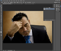
So with that said, here is my image i wish to use the pen tool with:

Apart from looking obviously stressed out and like he's trying to think happy thoughts, he is also behind a background which doesn't allow us to either create a good vector out of him or a png with a transparent background. To fix this we must take to photoshop and remove it whilst also keeping his seat and hair in the picture.

Now, we could easily use the magic wand tool for this but that's not always the best thing to do. The magic wand tool bases what it selects off of colour and though in this instance would be okay to use for the sake of demonstration i will take you over how to use your pen tool on photoshop.

Something to know beforehand -
  • Anchor points - points you have made by clicking onto the canvas with the pen tool selected.
In order to start using the pen tool, you must first locate it of course. The pen tool is allocated on the left side where every other tool is, for instance, the type tool.


Here is an image of the pen tool so you know what to click on.

Now it's time to place our first anchor point, this is where our cutting out process will start, with the pen tool click and start at a place which feels and looks right to you. I have chosen mine to be at the start of the mans suit on the right-hand side.
Below is an image of the second to creating a path around your entire image you want to cut out. In order to achieve bent and curved lines, clicking and holding allows you to curve your path to your liking but can also create a problem i'll go over in the next step.

You may notice two lines coming off of the anchor point you place and curved, this is because it takes the angle at which you curved your path in order follow along that, but we don't want this so what we must do is hover the anchor point and click whilst you have Alt/Option held down/ This will delete your angle and allow you to freely bend and curve your path again. Now do this around your entire picture.


Here is my finished pathing all done from one side to the other, now all thats left to do is join the two end anchors together to crate a finished path. Once you've done this, open the paths tab and once you have your cursor hovered over the small box showing you your path, hold Ctrl and click, this will make your path into a selection. From here just simply copy and paste and you have your image cut out.
Final product, image has been cut out using the pen tool


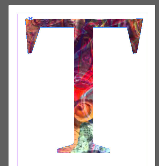
Putting image into type - Indesign

To start of with putting an image into your text you must first write what you wish your image to be put into, for this example I went with some very basic which is just a single letter but will explain what i'm trying to achieve.


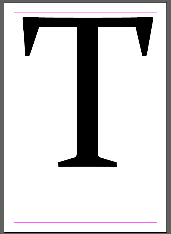
Here is my letter T spread across my page. Fonts which are serif fonts are much better to use for this than sans-serif but what you doesn't really matter completely unless you use a font which imitates such things like brush strokes.


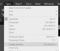
Head over to the type drop down menu on the main tool bar along the top of Indesign, from here make your way down to "create outlines". What this will do is creat an outline around your letter as a path.
Now with this done, you're ready to place your image, to do this press cmd+D or Ctrl+D and select the image you want to use. Your result should look like this.

finished product - putting an image into text

Creating portraits with text - Layer Masking

In this post i will teaching and telling you how to create a portrait completely out of text using a few tricks in order to create this neat effect.

Step 1: 

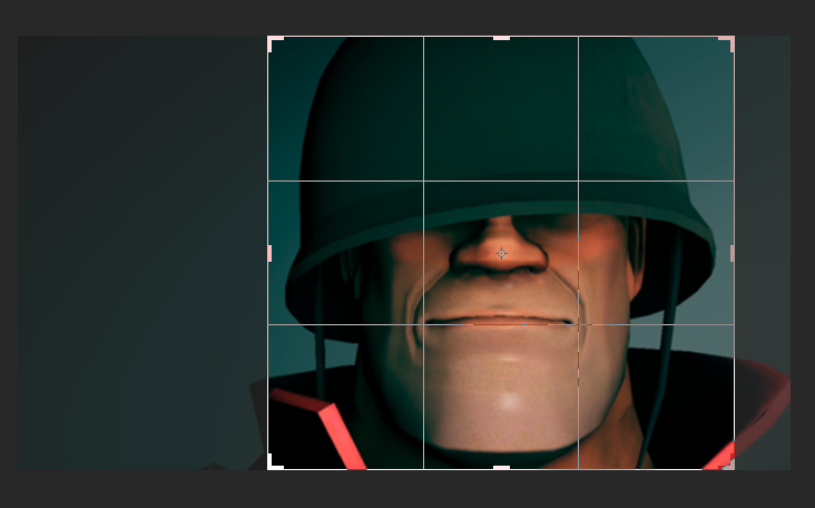
 First step of making this all possible is to gather the image you want and to open it into photoshop for editing, next you want to crop your image so it focuses around the more.

Here you can see me cropping an image of the soldier so it focuses a lot more onto his face and doesn't have the empty background left anymore.


Step 2:


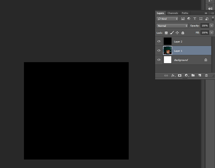
 Create a new layer! After you've done that, make sure the layer is above the layer of your picture and fill it completely black by using the fill bucket tool and a solid black colour.

You can see both my picture layer and my solid black colour layer in the layers tab with the solid black on top of the image we want to turn into text.


Step 3:


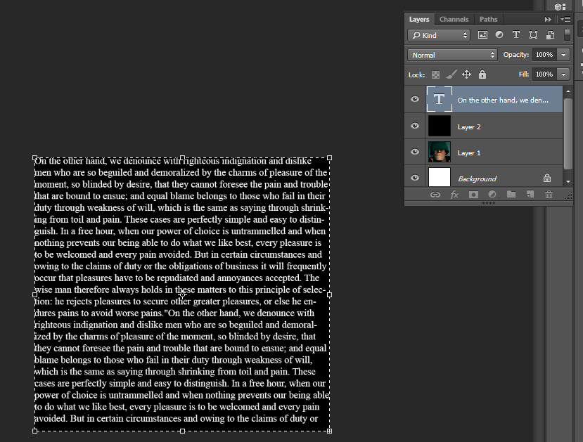
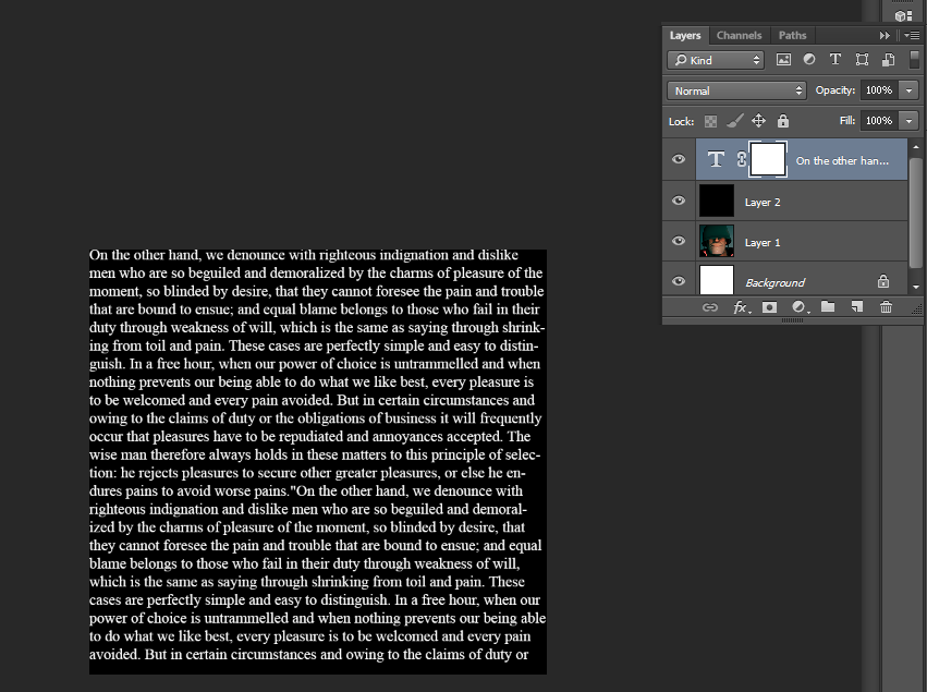
Select the type tool and drag a text box along the whole of your canvas, this will create a massive text box which you can fill completely with text. For this demonstration though, i will be using placeholder text.

This screenshot displays all my layers used so far and the placeholder text on top of the black canvas we created earlier. It's important to make sure your text fills the entire image you which to transform.


Step 4:


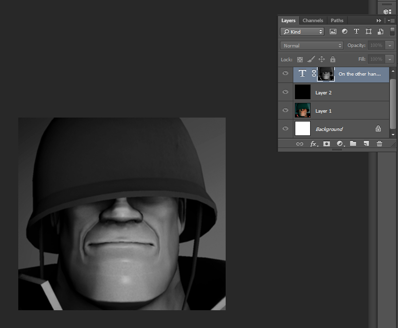
Copy the original photo or image you want to turn into text, you can do this by selecting the layer and pressing ctrl+A or CMD+A and then proceeding to copy it to your clipboard by pressing Ctrl+c or CMD+C.

With your original image on your clipboard, create a mask on the text layer, this can be done by click the rectangle with a small hole cut out in the certain button with the text layer selected. You should get something like this.


Step 5:


Hold Alt or Option as you click onto the layer mask thumbnail, this allows us to see what is on the mask and also allow us to paste our image directly onto the layer mask. now press Ctrl+C or CMD+C to paste your image directly into the layer mask.

Because layer masks can only deal with black and white, as well as shades of grey the image you chose won't appeared coloured.


Step 5:


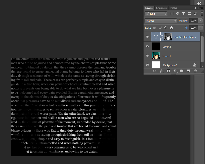
 Now click back onto your text and off of the layer mask and you should see your text is now being masked by the image.

If you are unhappy with your result you can also make it brighter. This is done by selecting the text layer and pressing Ctrl+J or CMD+J which will duplicate the layer and overall make it look brighter and better if it is too dark currently.


Finished product

Indesign Technical Skills Part 1

Creating the base document for our Booklets:

How to create the document - File -> New Document
Settings - 
  • Intent - Print
  • A5 page size ( Width = 148mm Height = 210mm)
  • Pages - 12
  • Start Page - 1
  • Facing Pages checked
Technical settings -
  • Columns - 3
  • Gutter - 3mm
 Margins for each page -
  • Top - 12mm
  • Bottom - 14mm
  • Inside - 8mm
  • Outside - 8mm
Bleed and Slug -
  • Bleed - 3mm when printing
  • Slug - Printer notes: Spot Colours
 How to change columns for each individual page:


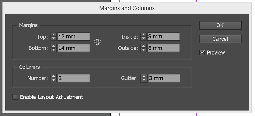
 To change the amount of columns which appears in a certain page first you must navigate your way to the page you want to change and locate the tab called "Layout" at the top of the program. From here select "Margins + Columns".


This will prompt open a box where you can edit the length of the margins in Milimetres or change the number of columns on that specific page and also the gutter if you want to/ need to do so.


 See now how we've changed the three columns we had into just two now. This isn't done for every page though but its handy to know for if you want edit and delete or add more columns to your work over time.


Indesign Technical Skills Part 2

Text tool and altering text:

(Note: Clicking on images will make appear them at their full size)


This is the text button on the tool in Indesign, it is allocated on the left hand side and is defined by the capital T inside a box. Selecting this will allow you to draw a box where your text can be added into. You can make the box any size you like doing this.


Now my text box has been drawn, i have filled it with placeholder text to show you how it all fits together inside the box. I will come back to this and how to link text boxes together but for now i would like to write about how kerning and tracking works inside Indesign and how you can alter it and alter the leading for headers.


Altering Kerning, Tracking and Leading:


Above this text is the character toolbar, on here are a number of different things which all do different stuff.

 Kerning - 

The first one i'd like to speak about is the kerning section. The kerning does exactly what it says it does, which if you read earlier in my blog, means that the distance between each character can be altered and made bigger or smaller. This is useful for fonts which don't have proper kerning already but also if you wish to space out your character a bit more so you can have a big title or initial spelled out across a page.

The Kerning section is identified by this section.


Tracking - 

The tracking section makes the space between your text get bigger or smaller dependent on what you choose to do with it. Altering tracking is used when you fonts don't have proper tracking incorporated into them but also when you may want split words going across a page without having to draw multiple text boxes and want every word to have the same effects or style applied to them unless done by specifically highlighting certain letters and leaving out others, say for instance, inserting an image into text. Every character across the page would be affected by this depending on if your image reaches that far and is high enough resolution and if all the letters are selected.

The Tracking section is identified by this section.


Leading - 

Leading and altering leading is usually used for headers and what it essentially does is create less or more space between the line of text above and line of text below, so that you can make text stand on its own and have the rest of your writing lower down and at a normal leading. Apart from this, there isn't more to say aboutleading other than its only really done to seperate the header of a page from the rest of the text.

The Leading section is identified by this section.

Indesign Technical Skills Part 3

Adding placeholder text, paragraph formatting columns, linking text boxes and image placing:

In the third part of showing the techinical Indesign skills i've learnt i will be covering how to paragraph format your columns and split up text boxes into writing columns by linking two text boxes together so when one is full, the text will transfer to the linked box and will continue to do so even if you want to resize the first box and make it smaller.

Adding placeholder text -

Adding placeholder text to your text boxes is extremely easy and allows you to see how your text boxes would work and what it'd be like when linked with another. It's a fast and easy way to fill up your text boxes with a lot of different works in a different language to get the gist and idea of what your text would be like. You can also adjust the leading, kerning and tracking of the placeholder text for a more indepth look and idea of how your work would be.

To get your placeholder text you must first draw your text box and choose how big or wide you like it, though it really does not matter for this demonstration.

Once you have your text box drawn, head over to the toolbar at the top of Indesign and click onto "Type". This will bring down a drop down menu where you are able to do a number of different things with your text and such.

The option we are interested in though is called "Fill with Placeholder Text", this does exactly what you think and your text box will now be added with placeholder text like below.


That's all there is to it, you now have placeholder text within in your text box which you can edit and play around with if you wish by using the kerning, tracking and leading sections on the type attributes toolbar.


Paragraph Formatting Columns -

Paragraph formatting your columns allows you, the user to choose how and where your text starts and continues from, nearly every word and typing program has this feature but for Indesign its a little more hidden and technical to find. This section is all about debunking how to format your columns text and paragraphs to how you like. Let's take a look at the tool bar for paragraph formatting.


To get to this you must click the small "¶" under the "A" on your text attributes bar, this brings up your paragraph formatting bar where you can change several different things about your text.

On the toolbar you can change where the text starts from as you type you allign your text to right, left or center. More options also allow you to allign your text towards or away from the spine and also justify the last line left or centre and also sort and create indents at specific lengths on your document.

First image alligned from the left, second image from the centre and last image from the right

 Here are a few examples of how placeholder text looks when alligned differently.


Linking text boxes -

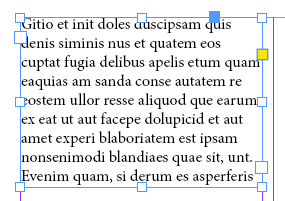
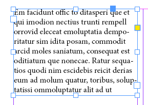
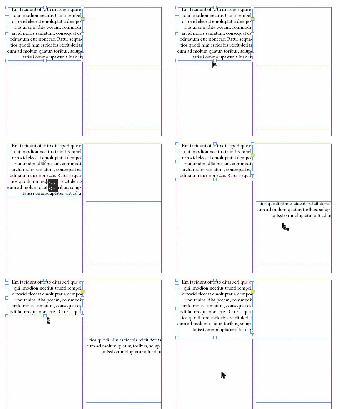
Linking text boxes allows the user to carry on writing without their text overflowing past the text box and also let text fill a different linked text box if the original text box is shortened and made smaller so where text would normally get cut off doesn't and isn't lost. For this i will be using my current text box filled with placeholder text and demonstrate that as i make the box smaller it will transfer to a linked text box and how to link text boxes together.

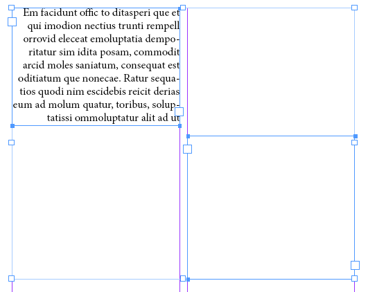
Starting off you should create another empty text box like i have. This will be the box we're going to link with our first box full of placeholder text.

With these two text boxes you may notice two different boxes along the outside just above one of the four corners, clicking this
it will bring up a small version of your text which if you hover over
your text box you'll see a chain link appear. Clicking on the text box with this will now link your text boxes, so let's check out what we've done.


As you can see, the text now flows into the second when resized to a smaller state than the text inside your text box. And that is how you link text boxes together so text wont become cut off and can be transferred to another box if you feel you need to make one box smaller than the other.


Placing images:

Placing images is just as easy as creating placeholder text for your publications and here is the fastest and easiest way of doing so click onto your document and press cmd+D or ctrl+D. This will prompt an interface where you can chose what image you want to add.


 Once you have the image selected that you want, click okay and you'll be brought back to your Indesign document and where you can place it.

When placed feel free to place it and drag it where you like and that's it. You can now place and add images to your documents.
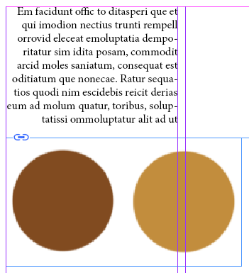

Finalized picture for adding images to Indesign